
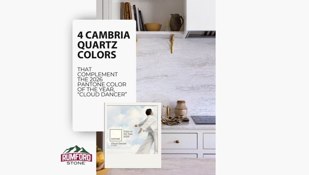
Soft whites are not always as simple as they look. A color like Cloud Dancer reads airy and light, but it still has direction. It leans calm, clean, and slightly atmospheric rather than stark or clinical. When that kind of tone starts showing up in interiors, the materials around it matter.
For countertops, the best pairings are not always pure bright white. Often, the strongest complement comes from a surface with a little movement, warmth, or contrast built in. That gives the space more depth while still staying within the same quiet palette.
Here are four Cambria quartz colors that work well with that look.
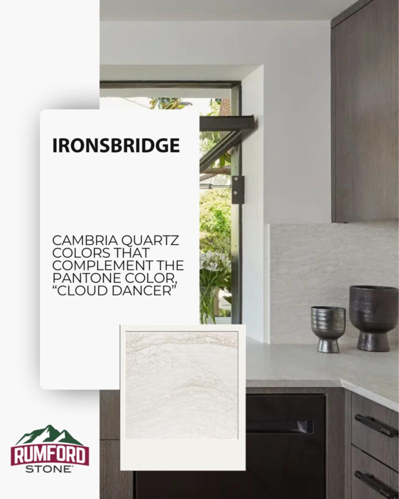
1. Ironsbridge
Ironsbridge brings softness first. Its warm undertones and subtle veining keep it from feeling flat, which makes it a natural fit with a shade like Cloud Dancer. The pairing feels easy and balanced, especially in kitchens that lean into light wood, warm neutrals, or muted taupe-gray cabinetry.
This is a good choice for anyone who wants a countertop that stays bright without turning cold.
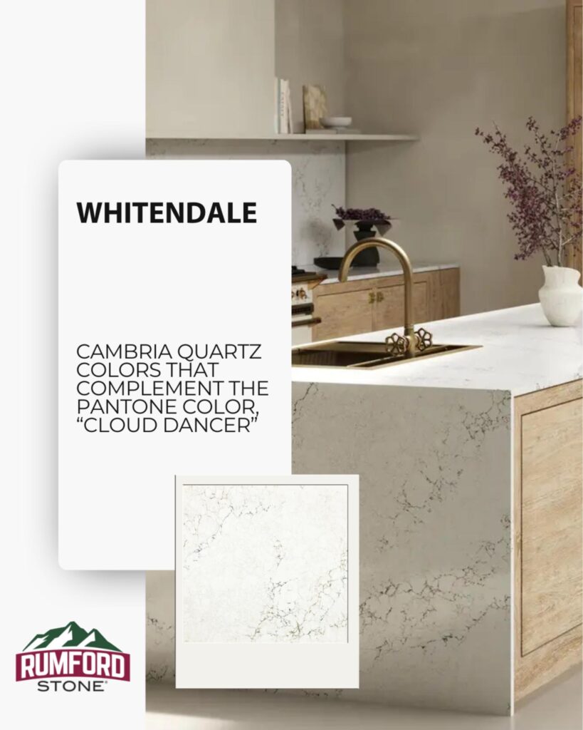
2. Whitendale
Whitendale has a fresh, airy quality, but the delicate veining gives it more visual structure. It complements a light color story well because it keeps the palette open while adding enough detail to make the surfaces feel finished.
In spaces with natural oak, brushed brass, soft beige paint, or off-white cabinetry, Whitendale helps hold everything together without pulling too much attention to itself.
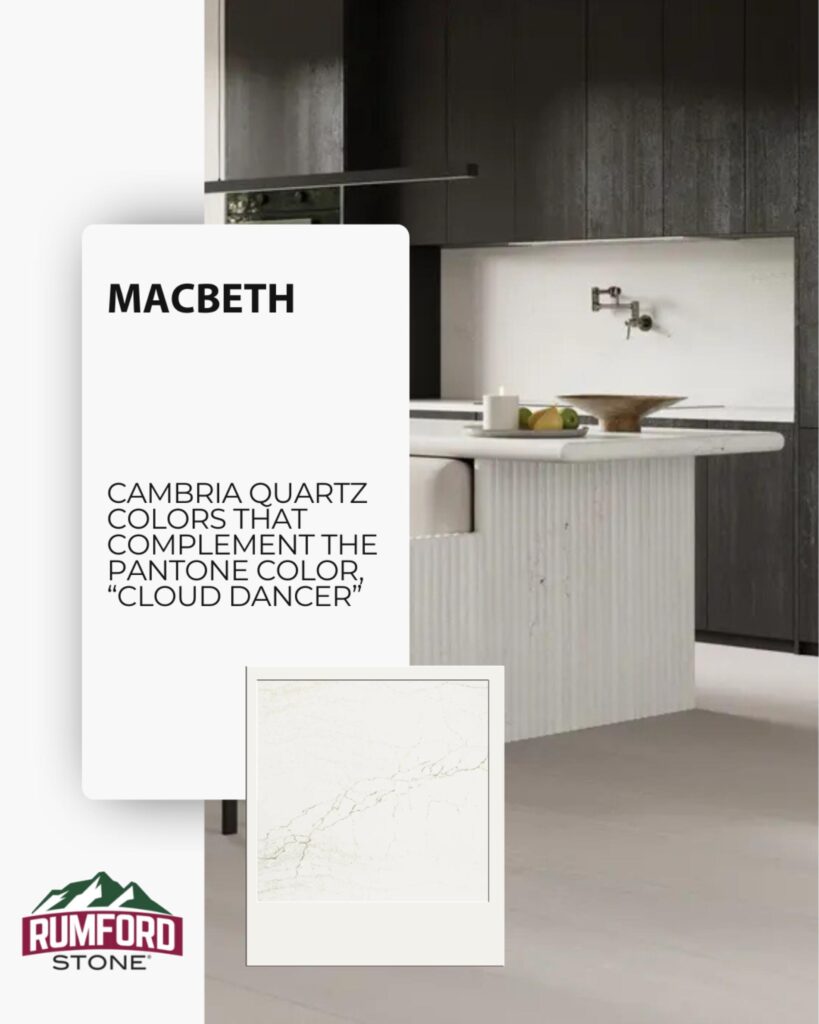
3. Macbeth
Macbeth is quieter and more restrained. The background stays light, while the veining is fine and understated. Paired with Cloud Dancer, it creates a look that feels soft, tailored, and a little more minimal.
This works especially well in kitchens with darker cabinetry or more modern lines, where the goal is contrast without harshness.
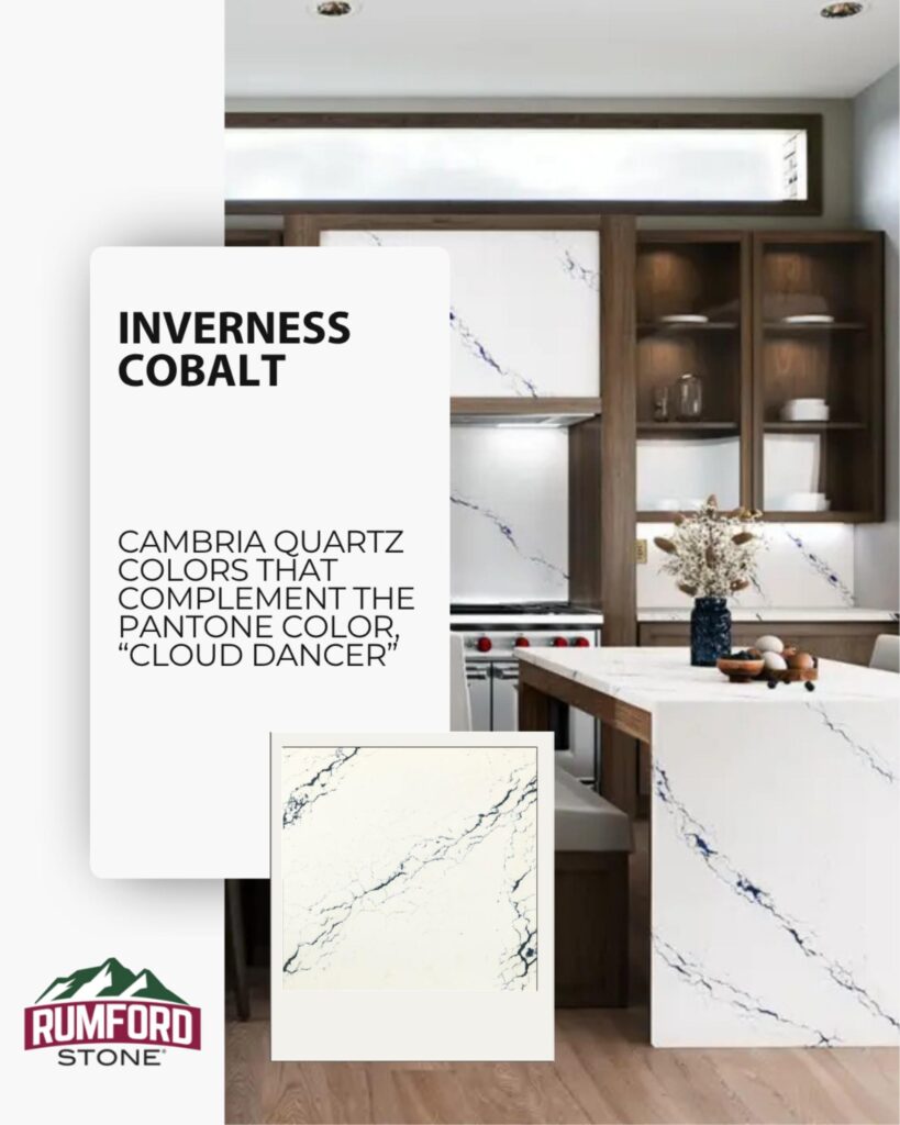
4. Inverness Cobalt
Inverness Cobalt takes the palette in a different direction. The base is still bright and light, but the blue veining introduces a stronger accent. Next to Cloud Dancer, it feels crisp and elevated, with more personality than the other options.
For homeowners who like soft neutrals but do not want the space to feel too quiet, this is the standout. It brings in color without losing the overall calm.
Choosing the Right One
All four of these Cambria quartz colors can work with a soft, cloudlike palette, but they do it in different ways. Ironsbridge adds warmth. Whitendale keeps things bright and layered. Macbeth leans minimal. Inverness Cobalt introduces contrast and color.
The best choice depends on what else is happening in the room. Cabinet tone, hardware finish, wall color, and how much movement you want in the slab all change the final effect. A light palette can still feel dramatically different from one kitchen to the next.
When the starting point is a color like Cloud Dancer, the goal is not to match it exactly. It is to build around it with materials that keep the space feeling soft, intentional, and complete.




