When people pick a tile, they usually think they’re most of the way there.
They’re not.
Two kitchens can use the exact same tile and end up looking completely different. The difference comes down to how that tile is installed. That’s where most of the design actually happens.
At Rumford Stone, backsplash decisions usually come up at the same time as countertops. Working alongside Capital Tile & Marble makes it easier to think through both at once, so the materials don’t fight each other later. When that coordination happens early, the finished kitchen tends to feel more intentional.
Once the tile is selected, the conversation shifts to layout. That’s where direction, pattern, and offset come into play.
Direction
The simplest place to start is direction.
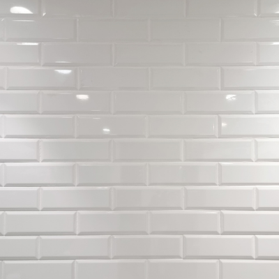
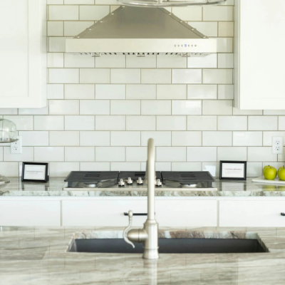
Subway tile doesn’t have to run horizontally. That’s just the version most people are used to seeing. When it does, it tends to make the space feel wider and more familiar. There’s nothing wrong with it, but it’s not the only option.
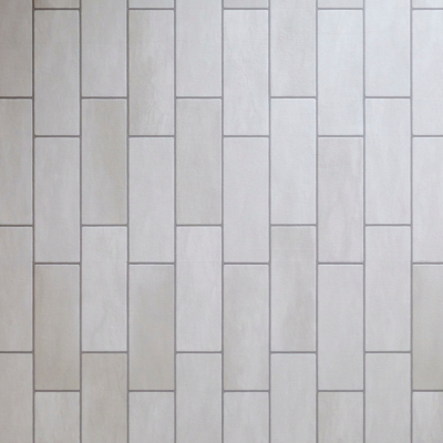
Turning the tile vertically changes the feel right away. It pulls your eye up and can make the wall feel taller. In kitchens with lower ceilings or tighter wall space, that small shift can make a noticeable difference.
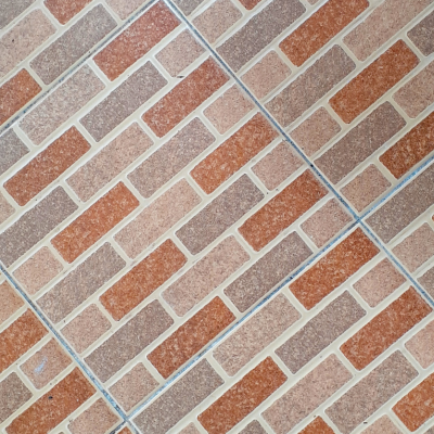
Diagonal layouts show up less often, but they introduce movement that the other two don’t. It’s not something you use everywhere, but in the right spot it breaks up the space in a way that feels deliberate.
Direction sets the tone. Everything else builds on top of it.
Pattern
Once direction is decided, pattern is what gives the backsplash its structure.
This is where the same tile can either stay quiet or start to stand out. A running bond pattern is the most common because it’s predictable and easy to work with. It doesn’t draw much attention to itself, which is often the goal.
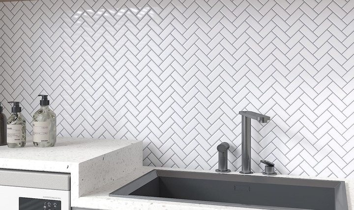
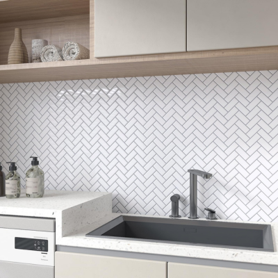
Herringbone is different. It takes more time to install and more planning to lay out, but it creates movement that you can’t get from a standard layout. It tends to show up more when the backsplash is meant to be a feature.
Crosshatch sits somewhere in between. It’s more structured and geometric, without being overly complicated.
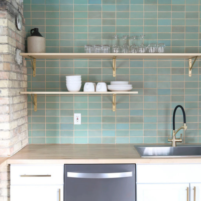
Stacked layouts keep everything aligned. There’s no stagger, no shift, just a clean grid. In the right kitchen, that simplicity reads as modern instead of plain.
Pattern is usually where a backsplash either blends in or becomes part of the design conversation.
Offset
Offset is the part people don’t always think about until they see it.
It controls how each row lines up with the one below it. With a half offset, each tile sits centered over the joint beneath it. That’s the traditional subway look most people recognize.
A one-third offset changes that rhythm. The stagger is more subtle, and the pattern feels a little more controlled. It’s also used in cases where a full half offset doesn’t sit well with the proportions of the tile.
A stacked layout removes the offset completely. Everything lines up, which creates a cleaner and more structured look.
None of these are complicated decisions on their own, but they change how the backsplash reads once it’s on the wall.
Putting It Together
Single decisions need to come together in the end to give you the perfect backsplash for your home.
A vertical stacked layout feels very different from a horizontal running bond, even with the same tile. That’s why it helps to look at the backsplash as part of the full kitchen instead of a separate element.
If the countertop has a lot of movement, the backsplash usually needs to settle things down. If the countertop is more consistent, the tile can take on more of the visual weight. Most of the time, the best result comes from letting one element lead and keeping the others supportive.
Final Thoughts
Tile backsplash design doesn’t come down to the tile itself, it comes down to how it’s installed. Those decisions are easy to overlook because they don’t show up on a sample, but once the tile is on the wall they’re the first thing you notice. Taking a little more time to think through direction, pattern, and offset usually leads to a result that feels like it belongs in the space instead of something that was added at the end.