
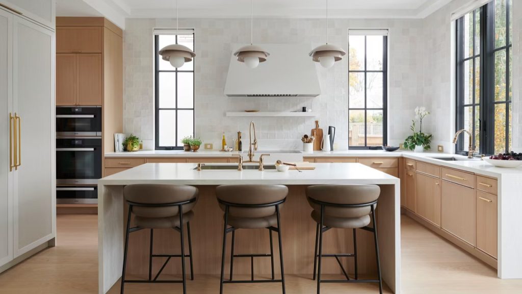
Quartz has been a trusted countertop choice for years because it is practical. It is non-porous, low maintenance, and easy to clean. For a lot of homeowners, that is the whole appeal. They want something durable that looks beautiful and holds up to daily life.
What makes VIATERA TrueView™ worth talking about is not that it changes what quartz is. It changes how quartz looks.
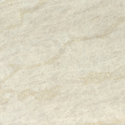
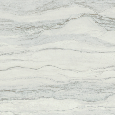
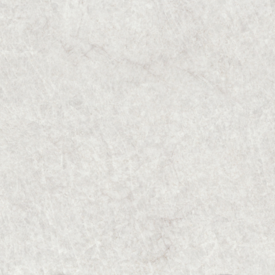
At Rumford Stone, TrueView™ is available in three colors: Taj Duna, Crystallo Vera, and Perla Verde. What connects them is a more stone-like visual effect, with added depth and stronger continuity across the slab. That may sound subtle on paper, but it can become much more noticeable once a design includes a large island, a waterfall edge, or any detail where the surface is seen from multiple angles.
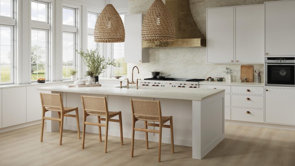
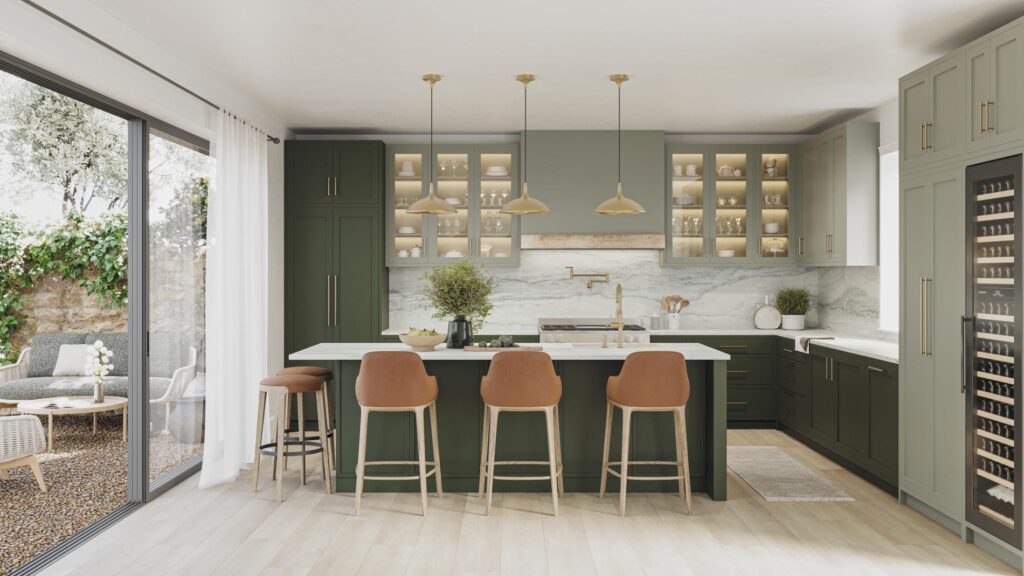
With many quartz surfaces, the first impression comes from the face of the slab. That is what most people notice in a showroom or sample. In an actual kitchen, though, the experience is broader than that. You see the edge. You see the return. You see how the movement carries, or does not carry, once the material changes direction.
That is part of what makes TrueView™ different.
Rather than giving quartz a flatter, more controlled appearance, it is designed to create more visual depth and a more natural flow in the pattern. For homeowners drawn to the look of marble or quartzite, that can make the surface feel less uniform and more layered. The overall effect is still polished and clean, but it reads with more movement and more dimension.
Another part of the conversation is full-body or thru-vein design. That matters most in places where the edge is visible. A thick-looking island, a mitered profile, or a waterfall end all put more attention on the side of the material, not just the top. When a surface has stronger continuity through those transitions, the finished installation can feel more resolved and more believable as a stone-inspired look.
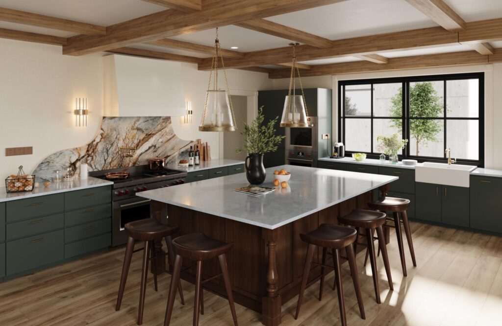
For a homeowner, that usually matters more than the technical language behind it. The real question is simpler: what do you want the room to feel like?
Some kitchens benefit from a cleaner, quieter quartz look with a more even visual rhythm. Others need more movement. Sometimes the design calls for a surface that plays a larger role in the room, especially when the countertops are expansive or the material continues down the side of an island. In those spaces, the visual depth of TrueView™ may stand out more.
The daily use story, though, still feels familiar. TrueView™ remains part of the quartz category, so the maintenance and care is still very similar to what you can expect with a quartz product. Homeowners still get a surface known for easy care, no sealing, and straightforward upkeep. That is important, because the appeal here is not just appearance. It is the combination of a more developed look with the practicality people already expect from quartz.
The three TrueView™ colors Rumford Stone offers each bring something a little different.
Taj Duna has warmth and softness, with an overall look that recalls Taj Mahal-inspired quartzite. It works well in kitchens that want a calm, natural palette without feeling flat.
Crystallo Vera is lighter and brighter, with a more luminous feel. It suits projects that lean crisp, airy, and refined.
Perla Verde has the most atmospheric movement of the three, blending soft gray with touches of sage and deeper veining. It can bring a little more character into a space without pushing too far into something dramatic.
The value of TrueView™ shows up in the finished result. For homeowners who want quartz but are drawn to a surface with more depth, more movement, and a stronger sense of continuity, it offers a different visual direction without changing the day-to-day ease of living with quartz.




